
Permission is granted to copy, distribute and/or modify this document under the terms of the GNU Free Documentation License, Version 1.3, published by the Free Software Foundation. A copy of the license is included in the section entitled “GNU Free Documentation License”.
The Persistence of Vision Raytracer, or POV-Ray, is 3-dimensional raytracing software that uses text files to tell it where to put objects and effects in a scene. Unlike most raytracing software, POV-Ray does not require you to be skilled at drawing. At its most basic, you tell POV that you want one shape here, another shape there, and you’d like to combine these two simple shapes into a more complex shape, and put it over there. But you do not have to draw the shapes yourself, and you don’t have to draw them in perspective, draw their shadows, draw the light on them, or any of that stuff. The raytracer handles this for you.
You can download POV-Ray, and see the kinds of images it can produce, at the official website: http://www.povray.org/.
The Persistence of Vision web site at http://www.povray.org/ has documentation, tips, tricks, and links to several wonderful resources. The POV-Ray Book Project at http://book.povworld.org/ has a series of projects that guide you to more and more advanced use of POV-Ray. My own Persistence of Text at http://www.hoboes.com/NetLife/POV/ has a handful of detailed projects that guide you through understanding specific concepts in POV-Ray.
If you want to be inspired by what raytracing can do, go to the Internet Raytracing Competition at http://www.irtc.org/. They hold several competitions every year, and keep an archive of past contests going back to 1996. Many of the images there were created using Persistence of Vision. Go there if you are easily inspired, but not if you are easily discouraged.
Your most basic scenes will consist of a light source, a camera, and an object. Raytracers such as POV-Ray work by sending “rays” from the camera and following the “rays” through reflection, refraction, and absorption until the rays reach a light source or are lost in shadow. See http://en.wikipedia.org/wiki/Raytracing for a more detailed explanation of what raytracing is. Now, let’s create our first simple scene.
You should have already downloaded POV-Ray for your computer, and started it up. You will most likely have a blank document waiting for you to type your scene description. Scene descriptions in POV-Ray use a very formal “scene description language”. I’ll be using POV-Ray 3.6.1 for Mac OS X in the examples here. The location of menus and menu items will probably be slightly different if you are not using Mac OS X, but the scene description text will be exactly the same no matter what platform you are using.
Just about everything you put into a POV-Ray scene has to have a location. POV-Ray requires you to specify three numbers for each location. These numbers are the distance from an imaginary “origin” which might be thought of as the center of the universe.
A location of “5, 3, 6”, for example, would be a distance of five to the right of the center, a distance of three above the center, and a distance of six behind the center.
If you need to place something to the left of center, below the center, or in front of the center, you’ll use negative numbers: “-3, -9, -6”, for example.
What do those numbers mean in actual distance? It’s an important question, and one you’ll want to think about before you start placing things in your scene. You can decide that the numbers mean meters, feet, inches, miles, or even light-years. I always try to place a note at the top of my scenes reminding me of what the numbers mean.
Because you can move the camera wherever you want, the “center of the universe” is usually not the center of your image.
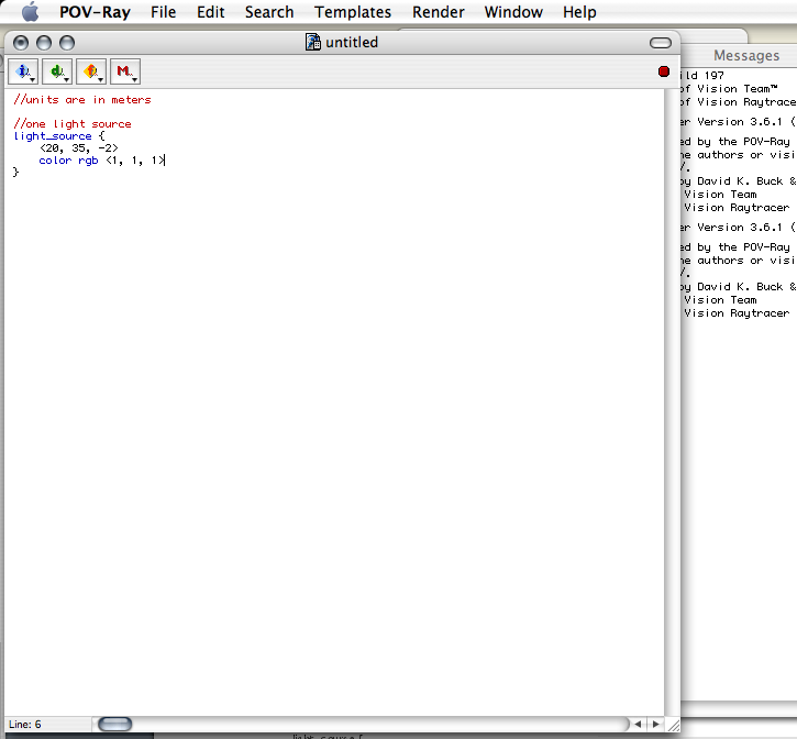
We need a light, a camera, and an object. Let’s do the light first. The first line of our scene will be our reminder about what the numbers for locations mean. Let’s go with meters. If you don’t have an open blank document in POV-Ray, pull down the “File” menu and choose “New”.
//units are in meters
Reminders and notes can be placed anywhere in your text, but must begin with two slashes. The two slashes tell POV-Ray that this line is not an instruction for it to place something within the scene.
You will usually want to put a note or reminder in front of every object, to remind of what their purpose is later.
Our light source is going to need a location and a color. You can have green lights, blue lights, chartreuse lights, if you want. Often, you’ll be using white lights. Colors in POV-Ray are usually specified with specific amounts of red, green, and blue.
//one light source
light_source {
<20, 35, -2>
color rgb <1, 1, 1>
}
This is how most objects in your scene will look in your text. The first line tells POV-Ray what kind of an object it is, followed by an open curly-bracket. The rest of the lines, down to the matching closing curly-bracket, describe that object. Our light source has two lines in its description. The first line is its location, and the second line is its color.
Locations are surrounded by less-than and greater-than symbols. This light source is 20 meters to the right, 35 meters up, and 2 meters towards us.
Because colors are specified using three numbers also, they often will look like locations. Here, we are saying that our color in RGB format is 1 for red, 1 for green, and 1 for blue. Colors range from 0 to 1, so these are the maximum numbers for all three colors. If you remember your color mixes, this makes the color white.
You can have many light sources in your scene, each in different locations, with different colors, and different intensities. The more light sources you have, the longer it will take for POV-Ray to create an image from your scene description.
Light sources cast light on the scene, but they are not themselves visible to the camera.
Our camera looks a lot like our light source.
//camera is at eye-level
camera {
location <0, 2, -10>
look_at <0, 0, 0>
}
This camera is two meters up and ten meters back. The camera is pointed straight towards the center of the universe: in the “look_at” location, each location number is zero.
While you can have many light sources in your scene, you can have only one camera.
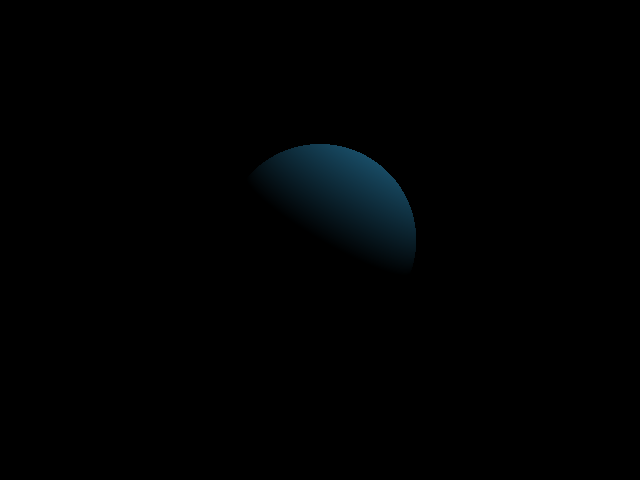
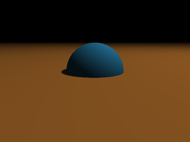
Now comes the moment of truth. We’re going to put something in our scene. At the center of the universe, we’re going to put a big sphere.
//the center of the universe
sphere {
<0, 0, 0>
2
pigment {
color rgb <.2, .6, .8>
}
}
This sphere is at location <0, 0, 0>, which is the center of POV-Ray’s universe. The next number, 2, is the radius of this sphere.
After that, we have a pigment section. A pigment section begins and ends with curly-brackets, just like objects do. Pigments can be quite complex, but in this case we’re just setting the color of the object’s pigment. The red is .2 (or 20% of maximum), the green is .6 (or 60% of maximum) and the blue is .8 (80% of maximum). This makes for a light blue.
Your scene should now have all three sections: lights, camera, and object.
//units are in meters
//one light source
light_source {
<20, 35, -2>
color rgb <1, 1, 1>
}
//camera is at eye-level
camera {
location <0, 2, -10>
look_at <0, 0, 0>
}
//the center of the universe
sphere {
<0, 0, 0>
2
pigment {
color rgb <.2, .6, .8>
}
}
 It is time to render so that we can see what our scene looks like. When POV-Ray renders an image, it uses raytracing to convert the text scene description into an image.
First, you need to save the document. POV-Ray will not render the file unless it is saved first. After you save it the first time, POV-Ray will automatically save it every time you re-render it.
We’re rendering an image of a big sphere, so call it something like “Big Sphere.pov”. You usually want your scene files to end in .pov so that POV-Ray will recognize that it owns those files.
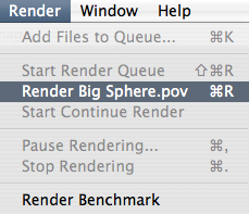
After saving the scene, you can pull down the “Render” menu and choose “Render”. POV-Ray will render your scene to an image file. Depending on your settings, it may also display a preview of the image on your display as it renders.
By default, POV-Ray places the image file in the same directory as the text scene file.
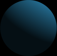
What we end up with is a blue sphere, with a light source up and to the right, against a black background.
You have several settings for what POV-Ray does while it renders. On Mac OS X, you can find the settings for your scene under the “Edit” menu. There are three important sections to the settings: the Scene, Quality, and Output panes.
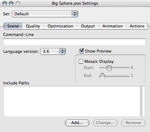
In the Scene pane, you’ll almost always want to have Show Preview checked. For scenes that take a long time to render, you might find Mosaic Display useful while testing the image. This renders the image in progressively smaller chunks, making it sort of “fade in” as it renders. This allows you to see potential mistakes without having to wait for the entire scene to render. Some complex scenes can take hours! None of the ones we’ll be working with here should take more than a few minutes, however.
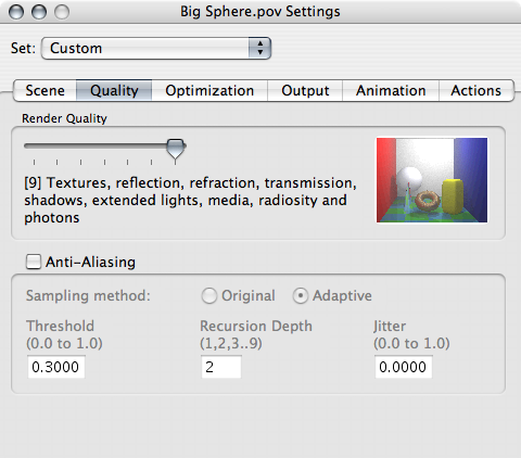
The Quality pane lets you specify the quality of your final image. If you reduce the quality, the render takes less time. Usually you will want to leave Render Quality at the maximum. When you reduce the quality you are actually removing information from the final image. Depending on the render quality, you may lose shadows, reflections, and even textures. A reduced-quality image often will not show you what you need to see to know whether your scene description is correct.
Anti-Aliasing smooths out the edges of your objects. More specifically, it smooths out the edges of any adjacent colors. Anti-aliasing almost always makes the resulting image look nicer. It makes the render take more time, however, so I will often leave anti-aliasing off until I’m finished. I’ll do the final render with anti-aliasing turned on.
Here’s a close-up of our blue sphere, with anti-aliasing turned off and anti-aliasing turned on. Notice the “staircase” effect on upper part of the left image.

The more sharp transitions from one color to another, the more you’ll need anti-aliasing for your final render. Anti-aliasing and mosaic preview do not work well together, so when you do your final, anti-aliased render you’ll want to turn mosaic preview off.
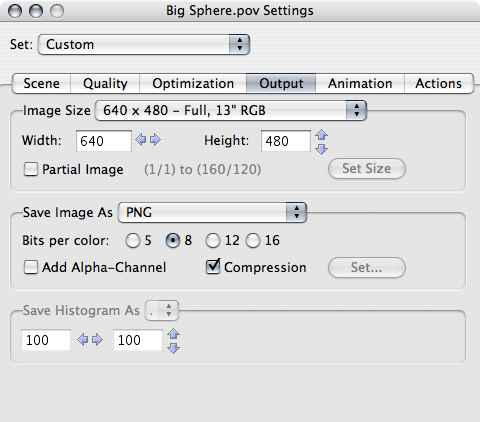
In the Output pane, you’ll set the size of the image, the kind of the image, and whether or not to add an alpha channel. I’ve been rendering this image at 640 by 480.
I prefer to save my rendered images as PNG, because it is a fairly universal format. From PNG, I can use image software such as GraphicConverter, GIMP, or Photoshop to convert the image to JPEG, GIF, or compressed PNG as needed. But I keep the original POV-Ray PNG so that I don’t have to re-render to get a higher quality image.
The alpha channel is very useful for creating web images and for merging POV-Ray images into photographs. Turning on the alpha channel makes the image transparent where nothing exists. In our current image, there is only one object, the sphere. If we turned the alpha channel on, every other part of the image would be transparent. This makes the image useful as, say, a button or icon on a web page. If your page is white and you put the blue sphere there, it will appear as a blue sphere on a white background: the black is transparent because nothing is there. The alpha channel is especially useful for anti-aliased images. In an anti-aliased image, the smoothed sections will have varying degrees of transparency, removing the halo effect you often see when trying to match smoothed images to a web page’s background color.
I hope I haven’t scared you with all these numbers because, at least for some of them, there is an easier way. POV-Ray comes with several files that contain useful objects and numbers. One of those files will let you specify your colors in English rather than as a series of red, green, and blue numbers.
In order to use this color file, you have to “include” it. In order to include it, you need to make sure that POV-Ray knows where your include files are. Under the “Edit” menu, choose “Preferences…”.
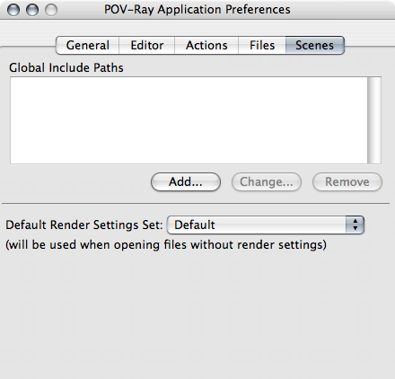
You want to add to the Global Include Paths. In your POV-Ray folder, there will be a folder called “include”. Click on the “Add…” button and choose that folder. Its path will appear in the Global Include Paths box.
Once you’ve told POV-Ray where to find your include files, we can use color names instead of RGB numbers in our scene. First, tell POV-Ray to include the “colors” file. Most include files will end in “.inc”.
//get some colors
#include "colors.inc"
Then, replace the color in the light_source:
//one light source
light_source {
<20, 35, -2>
color White
}
And the color in the sphere:
//the center of the universe
sphere {
<0, 0, 0>
2
pigment {
color SkyBlue
}
}
When you render this scene, it will look exactly as the other scene did.
You can mix RGB colors and color names throughout your scene as necessary.
There are two basic kinds of objects in POV-Ray: objects that have a definite end, and objects that go on forever. POV-Ray calls these finite objects and infinite objects. A sphere is a finite object. A plane is an infinite one. Let’s add a plane to our scene.
//it's Magrathea!
plane {
y, 0
pigment {
color Gold
}
}
Render this one and you’ve got half of a sphere protruding from a golden plane. A plane goes on forever in two directions. This plane goes on forever left and right, and forward and back. You specify which directions it goes on forever by telling POV-Ray which direction it does not go on forever.
Rather than using left, right, up, down, forward, and back, POV-Ray uses x, y, and z as its directions. What we’ve been calling left and right is ‘x’. What we’ve been calling up and down is ‘y’, and what we’ve been calling forward and back is ‘z’. From now on, we’re going to use x, y, and z as well. Left, right, up, down, forward, and back don’t make much sense when we start moving the camera around.
The center of the universe is zero x, zero y, and zero z.
When we tell POV that our plane is “y, 0”, we are saying that the y axis is perpendicular to the plane. And the plane is zero units away from y’s origin (or, zero units away from zero y).
Where planes go on to infinity in two directions, they are infinitely thin in the other direction. Temporarily change your camera’s location from a y of 2, to a y of 0:
//camera is at eye-level
camera {
location <0, 0, -10>
look_at <0, 0, 0>
}
The plane disappears completely! All you can see now is the shadow that it casts on the lower half of the sphere. This is because the plane is infinitely thin, and we are looking at the plane straight on. If we were even slightly above it or slightly below it, we would see the plane, but we’re not. Go ahead and try a ‘y’ location of .0001 or -.0001 for the camera and see what happens. In both cases, you’ll seen the plane and either the top or bottom half of the sphere.
Before going further, restore the camera’s y to 2 and re-render it to make sure it is still half of a blue sphere on a gold plane.
If you’ve been paying attention to the description of raytracing, you might be asking why the plane casts a shadow onto a visible sphere. The light source is above the plane. The plane goes on to infinity in the x and z directions. How does any light get below the plane? We shouldn’t be able to see the lower half of the sphere at all.
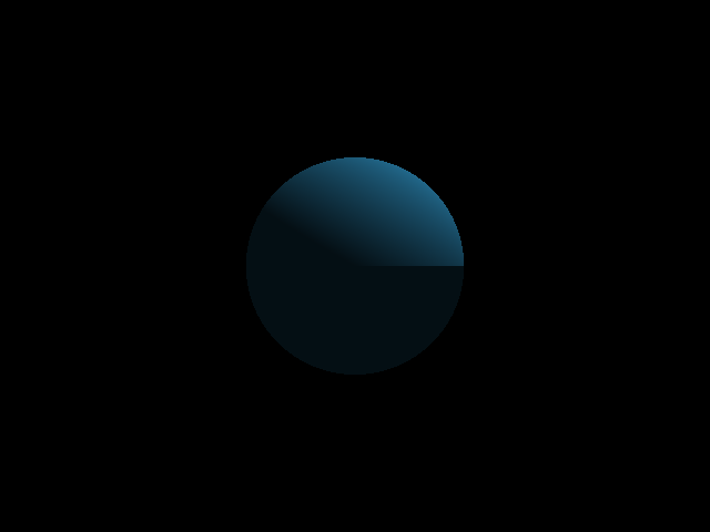
The reason it does show up is that POV-Ray assumes by default that there is “ambient light” throughout the scene. You can control this. There are two places to set the ambient light.
First, you have the global ambient. Add the following to the top of your scene:
global_settings {
ambient_light Black
}
This sets the general ambient light to zero. If you render the scene with the ambient light set to zero, the shadows will all become much sharper. If you change the camera’s location to below the plane, the whole scene will become black. That’s because there is no ambient light, and the one light source can’t illuminate below the plane.
By default, ambient_light is White. Often, you’ll set it to white, black, or some gray in-between. You can get some interesting effects by changing its color to something else, however. Go ahead and change it to Yellow in this scene and re-render it.
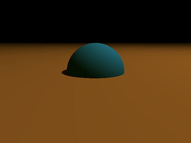
Notice how the shadows on the blue sphere have a yellowish tint? That’s from the ambient light.
POV-Ray gives you several simple objects that you can place in your scene. If you want more complex objects there are several ways of getting them. One of these ways is using constructive solid geometry, or CSG. With CSG you take simple objects and combine them into more complex objects. You can merge objects, unite them, cut them, and intersect them.
Once you’ve created a CSG object, CSG objects are themselves able to be used in merges, unions, differences, and intersections.
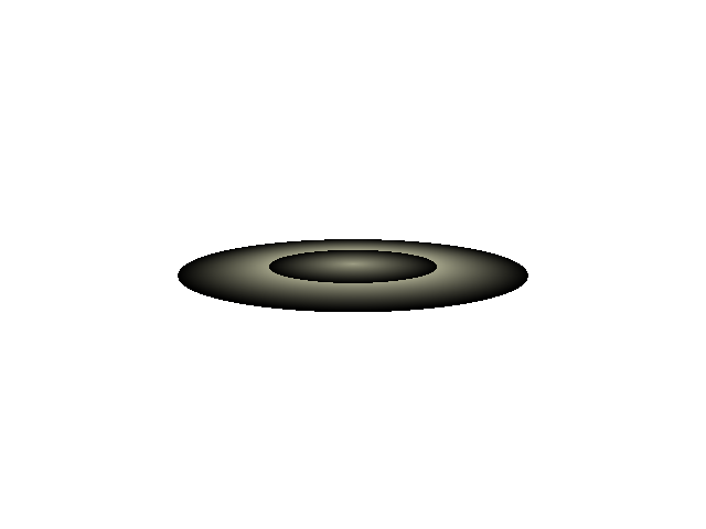
Let’s add a ring to our sphere. There is no such thing as a flat ring in POV-Ray (it does have a torus, but that’s a kind of donut shape). But it does have a cylinder. Below the sphere, add a cylinder object.
//ring around the sphere
cylinder {
<0, -.01, 0>, <0, .01, 0>, 3.2
pigment {
color Green
}
}
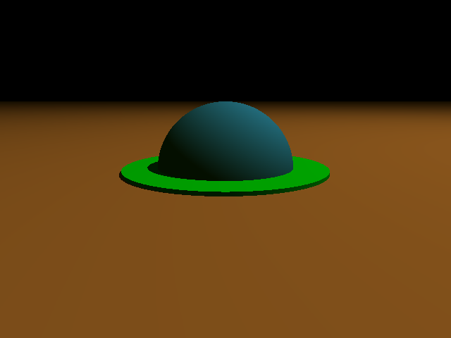 Cylinders are defined by their starting location, their ending location, and their radius. This cylinder starts at -.01 meters below the origin, ends at .01 meters above the origin, and is 3.2 meters in radius. It’s really more of a disc than a cylinder.
You should end up with a blue sphere with a green puddle around it on the plane.
We want this to be a ring, like a ring around a planet, so we don’t want the ring to go right up to the surface of the sphere. Let’s add another, smaller cylinder where we want the empty space to be.
cylinder {
<0, -.01, 0>, <0, .01, 0>, 2.8
}
 This looks strange. There’s green all the way to the center, but little black semicircles on the edge. It might even look different on yours than it does in this picture.
This is happening because we have two coincident surfaces. We have a black plane and a green plane whose surfaces are exactly the same once you get inside the radius of 2.8. Both of those cylinders start at y -.01 and end at y .01. POV-Ray has no idea which surface to use as the “real” surface at those points.
This is similar to the problem of looking at a plane straight-on. Because these numbers are exact numbers, we can tell POV-Ray to put things or look at things at exactly the same locations.
In this case, the solution is to make the inner cylinder start at slightly lower and higher points than the outer cylinder does.
 cylinder {
<0, -.02, 0>, <0, .02, 0>, 2.8
}
That’s better. This gives our green cylinder the basic shape we want, but we still have that black cylinder inside. We really want there to be nothing there. We want the cylinder to be, not a cylinder, but a ring.
This is what CSG is for. In CSG, we have a difference object that takes the difference between two other objects. We want the difference between our green cylinder and our inner cylinder. Surround the two cylinders with difference:
difference {
cylinder {
<0, -.01, 0>, <0, .01, 0>, 3.2
pigment {
color Green
}
}
cylinder {
<0, -.02, 0>, <0, .02, 0>, 2.8
}
}
 Okay, this is what we want. The ring circles the sphere with space between the sphere and the inner edge of the ring. Let’s add a little more “action” to the scene. We can rotate the ring so that it is on an angle.
First, remove the plane from the scene so that we’ll be able to see the whole ring when we angle it. It was a nice plane, but we won’t be needing it any more.
Then, add a “rotate” line to the difference section, just above the final curly bracket:
rotate <0, 0, 30>
 The complete difference section should be:
//ring around the sphere
difference {
cylinder {
<0, -.01, 0>, <0, .01, 0>, 3.2
pigment {
color Green
}
}
cylinder {
<0, -.02, 0>, <0, .02, 0>, 2.8
}
rotate <0, 0, 30>
}
The “rotate” line has a set of three numbers that look a lot like our other sets of three numbers. In this case, we’re rotating a number of degrees around the “pole” that we’ve specified. The numbers are still x, y, and z. We’ve told it to rotate 30 degrees around z. You can imagine z as a pole situated on zero x and zero y. It moves from front to back. Here’s a diagram (you can see how this diagram was made at The Persistence of Text).
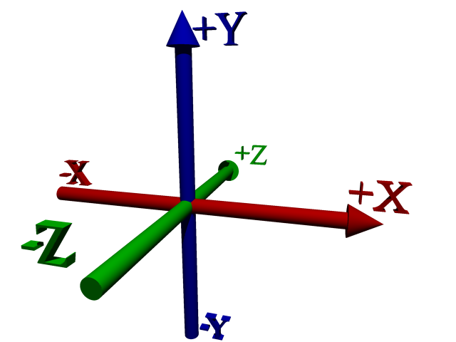
Rotating the ring <0, 0, 30> is like resting it on the green pole and rotating it 30 degrees, with the right side moving up. We could also rotate it around x and y. In this case rotating the ring solely around y wouldn’t change anything in the image. No matter how much you rotate it around y, it is still a green ring circling the sphere, flat on the other two poles. Now, having rotated it around z first, we could rotate it around y and that would move the lower end either towards or away from us. Go ahead and add another rotate after the current rotate, and play around with rotating it around x and y.
When you’re done, remove that second rotate.
That pigment statement has been standing out like a sore thumb, because we haven’t really talked about it yet. What’s the point of having a whole section for pigment if the only thing we can put in there are colors? In fact, we can do quite a bit more. Pigments can contain patterns.
Let’s start with something simple first. Our colors have so far contained three numbers: one for red, one for green, and one for blue. There is a fourth number in colors as well. It stands for filter and is assumed to be zero if it isn’t specified. Change your “color green” to:
color Green filter .5
 When you add a “filter” to a color, the color will let some light through. In this case, the color is green and the filter is .5, so any green light is let through at 50% of its normal strength. Take a look at the shadow that the ring is casting on the sphere. Where it was black, it now has a greenish tint to it.
Our light source is fully white, and white contains 100% red, green, and blue. When the filter on the ring was zero, the ring didn’t let any light through, thus casting a dark shadow onto the sphere. By specifying a filter of 50% for our green, we’re still not letting any red or blue light through, but any green gets dropped to half strength and continues on.
If you are specifying “rgb” values as we did before using the colors.inc include file, you can specify rgbf to add a fourth value for filter.
Pigment sections truly come into their own when we start using patterns with them. Patterns allow you to have the color vary from point to point according to, well, a pattern. There is a checkered pattern, a brick pattern, an onion pattern, as well as stranger patterns such as a bozo pattern and a crackle pattern. There are, in fact, many different patterns you can use. We’re going to look at two right now. The first is the cylindrical pattern, and the second will be the bozo pattern.
Patterns can sometimes be a lot easier to show than they are to explain. Go ahead and make a new scene document, and copy everything except the objects into it. Keep only our original cylinder. Your scene file should look like this:
//units are in meters
//get some colors
#include "colors.inc"
// place all settings of globally influenced features here
global_settings {
ambient_light Yellow
}
//one light source
light_source {
<20, 35, -2>
color White
}
//camera is at eye-level
camera {
location <0, 2, -10>
look_at <0, 0, 0>
}
cylinder {
<0, -.01, 0>, <0, .01, 0>, 3.2
pigment {
color Green
}
}
And when you render it you should see a bright green disc in the center of your image.
What we’d like this disc to do is have a rainbow-like range of colors in bands circling it. The pattern that will help us do this is the cylindrical pattern. Replace the pigment section with:
pigment {
cylindrical
}
When you render it, our disc becomes quite smaller, a tiny dot in the background radiating from white to black.
However, because our default background is black and our disc is turning black, we may not be seeing everything. Let’s tell POV-Ray to use a different color for the background.
background {
color White
}
 Just put that at the end of your scene, and then re-render.
As you can see, the disc is the same size as it always was, but only the tiny center has the cylindrical pattern applied to it. Everything else is black.
This happens because the cylindrical pattern, like many patterns, expects to see what is called a “unit-sized” object. That is, an object that goes from zero to one. Change the radius of the disc to 1 by replacing “3.2” with “1”.
cylinder {
<0, -.01, 0>, <0, .01, 0>, 1
pigment {
cylindrical
}
}
Now when you re-render, the pattern goes out to the edge of the disc, but that’s because we’ve made the disc smaller. We now need to make the disc large while making the pattern larger as well. We do this by scaling the cylinder after we apply the cylindrical pigment.
cylinder {
<0, -.01, 0>, <0, .01, 0>, 1
pigment {
cylindrical
}
scale <3.2, 1, 3.2>
}
 We’ve added one line: “scale <3.2, 1, 3.2>”. Scale changes the size of the object. And yet again we’re seeing a group of three numbers. These are our familiar x, y, and z. The first number makes the disc larger in the x directions: it multiplies x by 3.2. The second number applies to the y direction, but because we made it 1 the y size (the height) will not change. Multiplying y by 1 leaves us with the same height as before. The third number multiplies z by 3.2.
When applying patterns of this type, it will often be useful to make your object be “unit-sized” before applying the pigment, and then scale it after applying the pigment.
 That’s nice. We’ve got the disc sized correctly again, but the pattern is not exactly what we want for a planetary-style ring. It needs to go through the cycle of light to dark several times. We can change the number of cycles by adding a frequency line to the pigment.
pigment {
cylindrical
frequency 2
}
Frequency 2 tells it to cycle through the pattern two times. We’re getting closer. Try changing the frequency from 2 to 8.
That’s looking a lot nicer, so let’s bring that pigment back into our main scene. Remember to change the size of your cylinders: change the outer cylinder to radius 1, and the inner cylinder to radius .8:
//ring around the sphere
difference {
cylinder {
<0, -.01, 0>, <0, .01, 0>, 1
}
cylinder {
<0, -.02, 0>, <0, .02, 0>, .8
}
pigment {
cylindrical
frequency 8
}
scale <3.2, 1, 3.2>
rotate <0, 0, 30>
}
The sphere is now circled by a set of grey rings.
There are a couple of problems. First, we’ve lost our transparency, and second, we’d really like those rings to be in color. This is where things get tricky. A pattern in POV-Ray almost always has a range of possibilities from zero to one. That’s why we changed our rings to have a radius of 1 first, and then scaled them. We can tell POV-Ray what colors go at which points.
In the case of the cylindrical pattern, the center of the pattern is 1, and the outside of the pattern is 0. Beyond the outside—as in our original disc where the disc was larger than one unit—the pattern continues to be 0.
We can map colors to various points from 0 to 1. We always start at zero and move upwards to one. In the case of our cylindrical pattern, this means that the first color we choose will be at the outer edge, and the last color at the inner edge.
Often when using frequencies greater than one, or when using patterns that repeat, you’ll want the same color at each ends of the “map”. This creates a smooth transition between repetitions.
Here is our color map:
color_map {
[0.00 Magenta filter .5]
[0.30 Yellow filter .5]
[0.45 Green filter .5]
[0.60 Cyan filter .5]
[1.00 Magenta filter .5]
}
Add that to the ring’s pigment section.
At 0 and at 1 (at the outer edge and the inner edge) the ring will be Magenta. Inside, moving from the outer edge to the inner edge, it will transition from Magenta to Cyan to Green to Yellow and back to Magenta. Since we’ve set a frequency of 8, it will do this eight times from the center of the disc to the edge.
Remember that since we’re only looking at a portion of the disc—we took out the center by using a difference—we don’t see all eight repetitions.
For all colors, we’ve set the filter to 50%. This is what the pigment section of the rings should look like:
pigment {
cylindrical
frequency 8
color_map {
[0.00 Magenta filter .5]
[0.30 Yellow filter .5]
[0.45 Green filter .5]
[0.60 Cyan filter .5]
[1.00 Magenta filter .5]
}
}

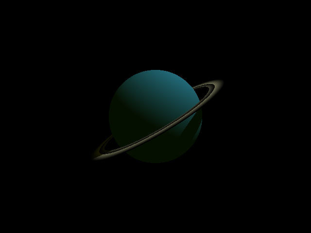
 Patterns are important enough that we are going to look at another one. The bozo pattern is meant to resemble things that are random when far from each other but that have similar values when close to each other. One of the things that bozos are great for are making cloud-like patterns over a surface. Change the SkyBlue sphere to a bozo pattern.
pigment {
bozo
}
That’s certainly something, isn’t it? Let’s add our own color map instead of using the default.
 pigment {
bozo
color_map {
[0.00 White]
[0.45 SkyBlue]
[0.55 SkyBlue]
[0.70 White]
[1.00 White]
}
}
That is a lot nicer. But we can do even better. Every pattern can be warped to change the shape of its contours. The most commonly-used feature of a warp, and the only one we’re going to use here, is turbulence. Turbulence adds random variation to a pattern.
Add:
warp {
turbulence .5
}
to your pigment, so that it reads:
pigment {
bozo
color_map {
[0.00 White]
[0.45 SkyBlue]
[0.55 SkyBlue]
[0.70 White]
[1.00 White]
}
warp {
turbulence .5
}
}
This is beginning to look like a place we’d like to visit.
While we were working on the cylindrical pattern, we added a background section to the test scene. Backgrounds tie into what we talked about earlier with alpha channels. The background is what POV-Ray shows when there is nothing in the scene. By default, POV-Ray shows black when there is nothing in the scene, but we can tell POV-Ray to show something else.
The simplest way to change the background is with the background section. You’ll often want to change the background to something other than black if you need a specific background color to match a web page or document’s background color. You will also sometimes want to change the background color if you are unsure where shadows end and the background begins. Changing the background to other than black will more clearly show what part of the image is shadow and what part is nothing.
Often, white is a good color for the background in both of the above cases.
background {
color White
}
Backgrounds cannot have patterns. They must be solid colors. They can, however, be any color. Also, it makes no sense for a background to be transparent, since a background means there is nothing in the scene to show.
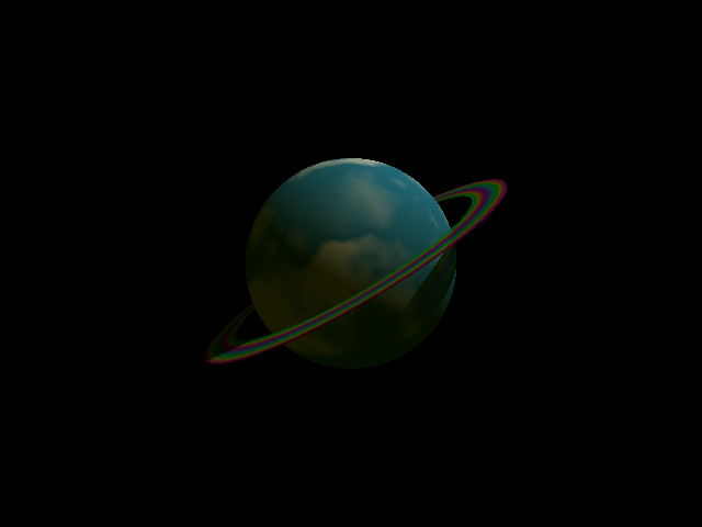
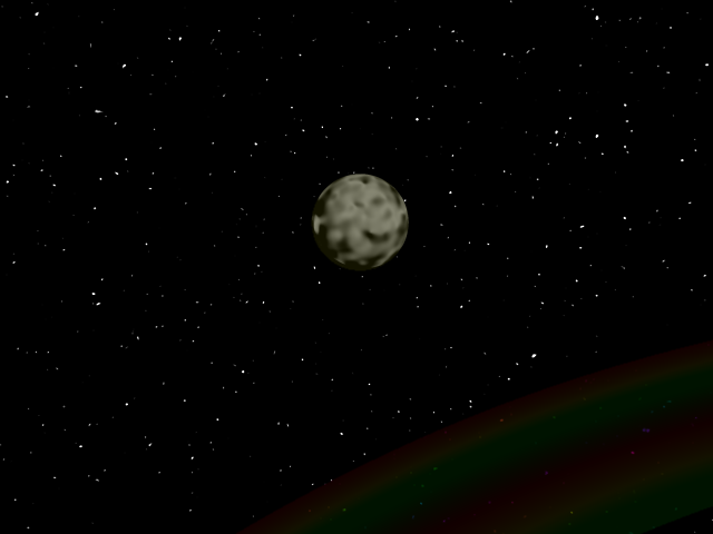
The sky sphere is a more complex form of background. You can use it when you want to simplify your scene: it allows you to place a pigment pattern into the scene, at an infinite distance, wherever nothing is. Often, you’ll use it to place a sky in your image or to place a star field.
Any pigment that you can place on an object, you can place on the sky sphere. There are some commonly-used pigments in the skies.inc include file for creating cloudy skies. We’d like to have a starry night, however, so we’ll need to make our own up.
A web search is often useful when you’re looking for some patterns for a specific purpose. A search on “povray starfield sky_sphere” found a couple of nice options: one using the crackle pattern and one galaxy include file. Because crackle is a very complex pattern to describe, I’m going to pretend we didn’t find anything useful, however, and go with what we know. The bozo pattern makes for a nice distribution of values that might work out well as a star field. Since we want the stars to be tiny points on a mostly black background, our color map will be a tiny section of white near one end, and the rest all black.
sky_sphere {
pigment {
bozo
color_map {
[0.0 White*3]
[0.2 Black]
[1.0 Black]
}
scale .006
}
}

As you can see above, pigments can be scaled just like objects can. We scaled it down so that there are many more white points in view. That is, so that more stars are visible. Play around with the scale, bringing it up towards 1, to see what happens as the scale effect is reduced. You can get some interesting effects that way.
Another interesting line above is in the color map. Our first color is White, multiplied by 3. Remember that the color names are just textual representations of the rgb colors. For white, the rgb colors are <1, 1, 1>. When you multiply it by 3, you get <3, 3, 3>. Didn’t I write earlier that color numbers go from zero to one? I did, and it’s true. But that doesn’t stop you from using higher numbers when necessary. It is often possible to tell POV-Ray to go outside its normal bounds to achieve a special, unnatural result. In this case, we’re trying to get bozo dots to look like stars. Making them ultra-bright helps.
It is important to remember that even when you are using a sky sphere, the sky sphere is just another background, and it is still what gets shown when there is nothing in the scene. If you turn on the alpha channel, for example, you won’t see the sky sphere.
As an example of that, I took the same image, turned the alpha channel on, and brought it into GIMP as a layer on top of a picture of a pond in Michigan.
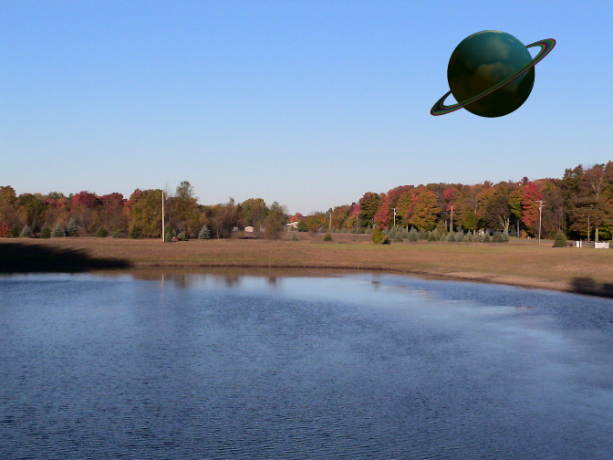
GIMP recognized the alpha channel automatically, and all I had to do was drag the planet to where in the photograph I wanted it. The sky (because it is in a lower layer in GIMP) shows through everywhere that the POV-Ray image has nothing in it.
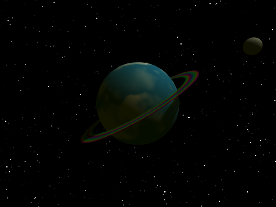
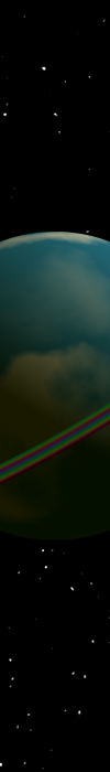
Our planetary model needs a moon. Let’s add a smaller sphere orbiting our big blue sphere. We’ll make this one gray, and angle it just a bit less than we angled the planet’s rings.
 //the moon
sphere {
<6, 0, 0>
.4
pigment {
color Grey
}
rotate <0, 0, 27>
}
We’ve put this moon out six units (six meters? we may want to rethink our scale) from the center of the universe. Remember that our central sphere has a radius of 2 units. So the moon will be about 4 units away from the planet’s surface.
Then we rotate it just 27 degrees around z. Rather than having it stick all the way off the edge like that, though, let’s put it on the other side of the planet. Make that rotate line be:
 rotate <0, 200, 27>
to rotate it 200 degrees around y first, before rotating it around z. This puts the moon down along the lower left, just above the rings.
Which is all fine and good, except that this is the most boring moon I’ve ever seen. It is completely smooth. We could try to add some pigment to it, but we really do want it to be grey, we just need some bumps on the surface.
There is a related section for objects, similar to pigment but which modifies the surface of the object. This is the normal section. It is called “normal” because that is a mathematical term for, basically, a pole that is perpendicular to the surface of an object. By altering the normal, we alter the appearance of the surface.
The normal section uses patterns just as the pigment section does. In fact, the same patterns will generally work in both places. Here, we are going to use the “bump” pattern to add bumps to the moon. Add, below the moon’s pigment:
normal {
bumps
scale .1
}
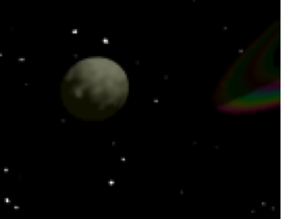 We have to scale the bumps because the moon is smaller than one unit in radius. In fact, it’s smaller than one unit in diameter: its radius is .4, so its diameter is .8. Patterns tend not to be as visible if they are larger than the object they are applied to, so we are scaling this pattern down to 10% of its default size.
The moon is now bumpy, but it isn’t bumpy enough. Some patterns will let us increase their strength. We can change the size of the bumps by adding a number after the word bumps. The default is .5. Change it to 1.5:
normal {
bumps 1.5
scale .1
}
 The moon is now nicely bumpy.
To be more precise, the normal section does not modify the surface of the object. It modifies the way that light bounces off of the surface of the object. If you look closely at this bumpy moon you’ll see that its outline remains completely spherical. What we’re really creating here is the illusion of bumpiness. But life is an illusion, raytracing doubly so. Modifying the normal to a surface rather than the surface itself is a shortcut that makes it easier for us to create basically sphere-like objects without having to draw out every bump and crack. It also makes it easier for POV-Ray to render the image of our scene. Because it is easier, POV-Ray takes less time to render the scene to an image.

We haven’t moved the camera at all in this tutorial, but you can put the camera wherever you want. For example, if you want to be on the surface of your planet looking up at the moon, replace the current camera section with:
//camera is on the surface looking out
camera {
location <-2, 0, 0>
look_at <-5, -3, 2>
}
Moving the camera can often be useful to track down problems with your scenes, or simply to gain a new perspective.
Put your camera location and look_at back to what we’ve been using.
location <0, 2, -10>
look_at <0, 0, 0>
All of the images we’ve made so far have been in “television format”. The width and the height are at an aspect ratio of 4 to 3, like a television set and like many computer monitors. As you’ll recall, I’ve been using 640 pixels wide by 480 pixels tall. Multiply 480 by 4/3 and you get 640.
This is a reasonable aspect ratio to work in, but it is not always what you want. Many computers now come with widescreen displays, and if you want to make a desktop background you’ll need to use a height and width that are not at a 4/3 aspect ratio.
For example, one common display size on widescreen displays is 1,680 pixels wide by 1,050 pixels tall. Go into the scene’s settings, go to the “Output” pane, and change the width to 1680 and the height to 1050. When you render the scene at this size, it will be oddly out of shape. The spheres will be stretched horizontally. That’s because our width and our height no longer match our aspect ratio.
We need to tell our camera to use the aspect ratio that matches the width and height we want. You can determine the aspect ratio by pulling out a calculator and dividing the width by the height. For 1,680 by 1,050, that’s an aspect ratio of 1.6.
The aspect ratio is the width divided by the height of the resulting image. In POV-Ray, you can tell the camera to use specific right and up triplets to determine the aspect ratio. The defaults that we’ve been using are:
right x*1.33
up y
The horizontal number (x) is 1.33. The vertical number (y) is unchanged at 1. This is the default aspect ratio of 4 to 3: four (horizontal) divided by three (vertical) is 1.33.
The up, with its unchanged y, is almost always what we want, so we can leave it at the default. What we’ll change is the right, which has the aspect ratio in it. We could change the 1.33 to 1.6 in this case, but we can also tell POV-Ray to calculate the aspect ratio automatically. POV-Ray has its own built-in calculator that you can use when you give it numbers. The built-in calculator also has some default values that depend on your scene. It has, for example, values for the image_width and the image_height. We can use those. The aspect ratio will be the image_width divided by the image_height.
camera {
location <0, 2, -10>
look_at <0, 0, 0>
right x*image_width/image_height
}
If you add that right line to your camera, you can experiment with rendering the scene in all sorts of shapes.
Try making a banner with a width of 700 pixels and a height of 100 pixels.

 Once you’ve got the aspect ratio automatic, you don’t need the width to be larger than the height. Switch the width and height around so that your banner is 100 pixels wide and 700 pixels tall, and you’ll get a nice side-banner. Changing the aspect ratio is like reshaping the window on which you view the scene.
 Take another look at those two banners. The wide one (700 by 100) shows the entire planet, tiny. The thin, tall one (100 by 700) shows only a portion of the planet, at about the same size as we’ve come to expect in our normal renderings.
The reason for the difference is that, in both cases, we are applying the aspect ratio change to the x, or right. When that change is large (700 divided by 100) we get a small image. When the change is tiny (100 divided by 700, we get a larger image.
If you want your vertical banner to show the entire planet in the same way it does in the horizontal banner, you can get that effect by applying the reverse change to the up, or y direction.
Remember that the default in POV-Ray is for right to be x*1.33 and for up to be y. If we choose to modify y instead of x, we have to tell POV-Ray to make right be just x.
camera {
location <0, 2, -10>
look_at <0, 0, 0>
//right x*image_width/image_height
right x
up y*image_height/image_width
}
Remember that when we put two slashes in front of a line, POV-Ray ignores that line. Look at the old right line and the new up line. What we’re doing to y in the up line is the opposite of what we did to the x in the right line. Instead of image_width divided by image_height, it is image_height divided by image_width. This produces the same size for the objects in the image as in our horizontal banner.
Let’s talk a little about the resolution of your image. You might, for example, need a high-resolution image for printing on an 8.5 by 11 inch paper. Your computer screen usually displays 72 pixels per inch. So when we create a 640 by 480 pixel image, that ends up being about 8.8 inches by 6.7 inches on the screen.
Printers, however, usually require a much higher resolution. For an image to appear high quality on a printer, you’ll need it to be 300 pixels per inch, or up to 600 pixels per inch for professional printing. For most basic purposes, resolution is the number of pixels per inch. The higher the resolution, the more pixels per inch.
This is where you need to pull out your computer’s built-in calculator. If you want an 8.5 inch by 11 inch image and you want 300 pixels per inch, this will be 2,550 pixels wide and 3,300 pixels tall. That’s 8.5 inches times 300 pixels, and 11 inches times 300 pixels.
Go to the Output pane and change width to 2550 and height to 3300. This will give you a huge, high-resolution image shaped for an 8.5 by 11 inch page.
This image will take a lot longer to render than our other examples. The larger you make the image, the longer it takes to render. This is a fairly simple scene and it has rendered nearly instantly for me at 640 by 480. At 2,550 pixels by 3,300 pixels it took almost a minute to render on my computer. When using rendering software, you will often need to be patient.
You will almost always want to render your test images at smaller sizes, and only do the full-size, high-resolution image when you are ready to wait.
Version 1.3, 3 November 2008
Copyright (C) 2000, 2001, 2002, 2007, 2008 Free Software Foundation, Inc. <http://fsf.org/>
Everyone is permitted to copy and distribute verbatim copies of this license document, but changing it is not allowed.
Preamble
The purpose of this License is to make a manual, textbook, or other functional and useful document “free” in the sense of freedom: to assure everyone the effective freedom to copy and redistribute it, with or without modifying it, either commercially or noncommercially. Secondarily, this License preserves for the author and publisher a way to get credit for their work, while not being considered responsible for modifications made by others.
This License is a kind of “copyleft”, which means that derivative works of the document must themselves be free in the same sense. It complements the GNU General Public License, which is a copyleft license designed for free software.
We have designed this License in order to use it for manuals for free software, because free software needs free documentation: a free program should come with manuals providing the same freedoms that the software does. But this License is not limited to software manuals; it can be used for any textual work, regardless of subject matter or whether it is published as a printed book. We recommend this License principally for works whose purpose is instruction or reference.
1. Applicability and definitions
This License applies to any manual or other work, in any medium, that contains a notice placed by the copyright holder saying it can be distributed under the terms of this License. Such a notice grants a world-wide, royalty-free license, unlimited in duration, to use that work under the conditions stated herein. The “Document”, below, refers to any such manual or work. Any member of the public is a licensee, and is addressed as “you”. You accept the license if you copy, modify or distribute the work in a way requiring permission under copyright law.
A “Modified Version” of the Document means any work containing the Document or a portion of it, either copied verbatim, or with modifications and/or translated into another language.
A “Secondary Section” is a named appendix or a front-matter section of the Document that deals exclusively with the relationship of the publishers or authors of the Document to the Document’s overall subject (or to related matters) and contains nothing that could fall directly within that overall subject. (Thus, if the Document is in part a textbook of mathematics, a Secondary Section may not explain any mathematics.) The relationship could be a matter of historical connection with the subject or with related matters, or of legal, commercial, philosophical, ethical or political position regarding them.
The “Invariant Sections” are certain Secondary Sections whose titles are designated, as being those of Invariant Sections, in the notice that says that the Document is released under this License. If a section does not fit the above definition of Secondary then it is not allowed to be designated as Invariant. The Document may contain zero Invariant Sections. If the Document does not identify any Invariant Sections then there are none.
The “Cover Texts” are certain short passages of text that are listed, as Front-Cover Texts or Back-Cover Texts, in the notice that says that the Document is released under this License. A Front-Cover Text may be at most 5 words, and a Back-Cover Text may be at most 25 words.
A “Transparent” copy of the Document means a machine-readable copy, represented in a format whose specification is available to the general public, that is suitable for revising the document straightforwardly with generic text editors or (for images composed of pixels) generic paint programs or (for drawings) some widely available drawing editor, and that is suitable for input to text formatters or for automatic translation to a variety of formats suitable for input to text formatters. A copy made in an otherwise Transparent file format whose markup, or absence of markup, has been arranged to thwart or discourage subsequent modification by readers is not Transparent. An image format is not Transparent if used for any substantial amount of text. A copy that is not “Transparent” is called “Opaque”.
Examples of suitable formats for Transparent copies include plain ASCII without markup, Texinfo input format, LaTeX input format, SGML or XML using a publicly available DTD, and standard-conforming simple HTML, PostScript or PDF designed for human modification. Examples of transparent image formats include PNG, XCF and JPG. Opaque formats include proprietary formats that can be read and edited only by proprietary word processors, SGML or XML for which the DTD and/or processing tools are not generally available, and the machine-generated HTML, PostScript or PDF produced by some word processors for output purposes only.
The “Title Page” means, for a printed book, the title page itself, plus such following pages as are needed to hold, legibly, the material this License requires to appear in the title page. For works in formats which do not have any title page as such, “Title Page” means the text near the most prominent appearance of the work’s title, preceding the beginning of the body of the text.
The “publisher” means any person or entity that distributes copies of the Document to the public.
A section “Entitled XYZ” means a named subunit of the Document whose title either is precisely XYZ or contains XYZ in parentheses following text that translates XYZ in another language. (Here XYZ stands for a specific section name mentioned below, such as “Acknowledgements”, “Dedications”, “Endorsements”, or “History”.) To “Preserve the Title” of such a section when you modify the Document means that it remains a section “Entitled XYZ” according to this definition.
The Document may include Warranty Disclaimers next to the notice which states that this License applies to the Document. These Warranty Disclaimers are considered to be included by reference in this License, but only as regards disclaiming warranties: any other implication that these Warranty Disclaimers may have is void and has no effect on the meaning of this License.
2. Verbatim copying
You may copy and distribute the Document in any medium, either commercially or noncommercially, provided that this License, the copyright notices, and the license notice saying this License applies to the Document are reproduced in all copies, and that you add no other conditions whatsoever to those of this License. You may not use technical measures to obstruct or control the reading or further copying of the copies you make or distribute. However, you may accept compensation in exchange for copies. If you distribute a large enough number of copies you must also follow the conditions in section 3.
You may also lend copies, under the same conditions stated above, and you may publicly display copies.
3. Copying in quantity
If you publish printed copies (or copies in media that commonly have printed covers) of the Document, numbering more than 100, and the Document’s license notice requires Cover Texts, you must enclose the copies in covers that carry, clearly and legibly, all these Cover Texts: Front-Cover Texts on the front cover, and Back-Cover Texts on the back cover. Both covers must also clearly and legibly identify you as the publisher of these copies. The front cover must present the full title with all words of the title equally prominent and visible. You may add other material on the covers in addition. Copying with changes limited to the covers, as long as they preserve the title of the Document and satisfy these conditions, can be treated as verbatim copying in other respects.
If the required texts for either cover are too voluminous to fit legibly, you should put the first ones listed (as many as fit reasonably) on the actual cover, and continue the rest onto adjacent pages.
If you publish or distribute Opaque copies of the Document numbering more than 100, you must either include a machine-readable Transparent copy along with each Opaque copy, or state in or with each Opaque copy a computer-network location from which the general network-using public has access to download using public-standard network protocols a complete Transparent copy of the Document, free of added material. If you use the latter option, you must take reasonably prudent steps, when you begin distribution of Opaque copies in quantity, to ensure that this Transparent copy will remain thus accessible at the stated location until at least one year after the last time you distribute an Opaque copy (directly or through your agents or retailers) of that edition to the public.
It is requested, but not required, that you contact the authors of the Document well before redistributing any large number of copies, to give them a chance to provide you with an updated version of the Document.
4. Modifications
You may copy and distribute a Modified Version of the Document under the conditions of sections 2 and 3 above, provided that you release the Modified Version under precisely this License, with the Modified Version filling the role of the Document, thus licensing distribution and modification of the Modified Version to whoever possesses a copy of it. In addition, you must do these things in the Modified Version:
A. Use in the Title Page (and on the covers, if any) a title distinct from that of the Document, and from those of previous versions (which should, if there were any, be listed in the History section of the Document). You may use the same title as a previous version if the original publisher of that version gives permission.
B. List on the Title Page, as authors, one or more persons or entities responsible for authorship of the modifications in the Modified Version, together with at least five of the principal authors of the Document (all of its principal authors, if it has fewer than five), unless they release you from this requirement.
C. State on the Title page the name of the publisher of the Modified Version, as the publisher.
D. Preserve all the copyright notices of the Document.
E. Add an appropriate copyright notice for your modifications adjacent to the other copyright notices.
F. Include, immediately after the copyright notices, a license notice giving the public permission to use the Modified Version under the terms of this License, in the form shown in the Addendum below.
G. Preserve in that license notice the full lists of Invariant Sections and required Cover Texts given in the Document’s license notice.
H. Include an unaltered copy of this License.
I. Preserve the section Entitled “History”, Preserve its Title, and add to it an item stating at least the title, year, new authors, and publisher of the Modified Version as given on the Title Page. If there is no section Entitled “History” in the Document, create one stating the title, year, authors, and publisher of the Document as given on its Title Page, then add an item describing the Modified Version as stated in the previous sentence.
J. Preserve the network location, if any, given in the Document for public access to a Transparent copy of the Document, and likewise the network locations given in the Document for previous versions it was based on. These may be placed in the “History” section. You may omit a network location for a work that was published at least four years before the Document itself, or if the original publisher of the version it refers to gives permission.
K. For any section Entitled “Acknowledgements” or “Dedications”, Preserve the Title of the section, and preserve in the section all the substance and tone of each of the contributor acknowledgements and/or dedications given therein.
L. Preserve all the Invariant Sections of the Document, unaltered in their text and in their titles. Section numbers or the equivalent are not considered part of the section titles.
M. Delete any section Entitled “Endorsements”. Such a section may not be included in the Modified Version.
N. Do not retitle any existing section to be Entitled “Endorsements” or to conflict in title with any Invariant Section.
O. Preserve any Warranty Disclaimers.
If the Modified Version includes new front-matter sections or appendices that qualify as Secondary Sections and contain no material copied from the Document, you may at your option designate some or all of these sections as invariant. To do this, add their titles to the list of Invariant Sections in the Modified Version’s license notice. These titles must be distinct from any other section titles.
You may add a section Entitled “Endorsements”, provided it contains nothing but endorsements of your Modified Version by various parties—for example, statements of peer review or that the text has been approved by an organization as the authoritative definition of a standard.
You may add a passage of up to five words as a Front-Cover Text, and a passage of up to 25 words as a Back-Cover Text, to the end of the list of Cover Texts in the Modified Version. Only one passage of Front-Cover Text and one of Back-Cover Text may be added by (or through arrangements made by) any one entity. If the Document already includes a cover text for the same cover, previously added by you or by arrangement made by the same entity you are acting on behalf of, you may not add another; but you may replace the old one, on explicit permission from the previous publisher that added the old one.
The author(s) and publisher(s) of the Document do not by this License give permission to use their names for publicity for or to assert or imply endorsement of any Modified Version.
5. Combining documents
You may combine the Document with other documents released under this License, under the terms defined in section 4 above for modified versions, provided that you include in the combination all of the Invariant Sections of all of the original documents, unmodified, and list them all as Invariant Sections of your combined work in its license notice, and that you preserve all their Warranty Disclaimers.
The combined work need only contain one copy of this License, and multiple identical Invariant Sections may be replaced with a single copy. If there are multiple Invariant Sections with the same name but different contents, make the title of each such section unique by adding at the end of it, in parentheses, the name of the original author or publisher of that section if known, or else a unique number. Make the same adjustment to the section titles in the list of Invariant Sections in the license notice of the combined work.
In the combination, you must combine any sections Entitled “History” in the various original documents, forming one section Entitled “History”; likewise combine any sections Entitled “Acknowledgements”, and any sections Entitled “Dedications”. You must delete all sections Entitled “Endorsements”.
6. Collections of documents
You may make a collection consisting of the Document and other documents released under this License, and replace the individual copies of this License in the various documents with a single copy that is included in the collection, provided that you follow the rules of this License for verbatim copying of each of the documents in all other respects.
You may extract a single document from such a collection, and distribute it individually under this License, provided you insert a copy of this License into the extracted document, and follow this License in all other respects regarding verbatim copying of that document.
7. Aggregation with independent works
A compilation of the Document or its derivatives with other separate and independent documents or works, in or on a volume of a storage or distribution medium, is called an “aggregate” if the copyright resulting from the compilation is not used to limit the legal rights of the compilation’s users beyond what the individual works permit. When the Document is included in an aggregate, this License does not apply to the other works in the aggregate which are not themselves derivative works of the Document.
If the Cover Text requirement of section 3 is applicable to these copies of the Document, then if the Document is less than one half of the entire aggregate, the Document’s Cover Texts may be placed on covers that bracket the Document within the aggregate, or the electronic equivalent of covers if the Document is in electronic form. Otherwise they must appear on printed covers that bracket the whole aggregate.
8. Translation
Translation is considered a kind of modification, so you may distribute translations of the Document under the terms of section 4. Replacing Invariant Sections with translations requires special permission from their copyright holders, but you may include translations of some or all Invariant Sections in addition to the original versions of these Invariant Sections. You may include a translation of this License, and all the license notices in the Document, and any Warranty Disclaimers, provided that you also include the original English version of this License and the original versions of those notices and disclaimers. In case of a disagreement between the translation and the original version of this License or a notice or disclaimer, the original version will prevail.
If a section in the Document is Entitled “Acknowledgements”, “Dedications”, or “History”, the requirement (section 4) to Preserve its Title (section 1) will typically require changing the actual title.
9. Termination
You may not copy, modify, sublicense, or distribute the Document except as expressly provided under this License. Any attempt otherwise to copy, modify, sublicense, or distribute it is void, and will automatically terminate your rights under this License.
However, if you cease all violation of this License, then your license from a particular copyright holder is reinstated (a) provisionally, unless and until the copyright holder explicitly and finally terminates your license, and (b) permanently, if the copyright holder fails to notify you of the violation by some reasonable means prior to 60 days after the cessation.
Moreover, your license from a particular copyright holder is reinstated permanently if the copyright holder notifies you of the violation by some reasonable means, this is the first time you have received notice of violation of this License (for any work) from that copyright holder, and you cure the violation prior to 30 days after your receipt of the notice.
Termination of your rights under this section does not terminate the licenses of parties who have received copies or rights from you under this License. If your rights have been terminated and not permanently reinstated, receipt of a copy of some or all of the same material does not give you any rights to use it.
10. Future revisions of this license
The Free Software Foundation may publish new, revised versions of the GNU Free Documentation License from time to time. Such new versions will be similar in spirit to the present version, but may differ in detail to address new problems or concerns. See http://www.gnu.org/copyleft/.
Each version of the License is given a distinguishing version number. If the Document specifies that a particular numbered version of this License “or any later version” applies to it, you have the option of following the terms and conditions either of that specified version or of any later version that has been published (not as a draft) by the Free Software Foundation. If the Document does not specify a version number of this License, you may choose any version ever published (not as a draft) by the Free Software Foundation. If the Document specifies that a proxy can decide which future versions of this License can be used, that proxy’s public statement of acceptance of a version permanently authorizes you to choose that version for the Document.
11. Relicensing
“Massive Multiauthor Collaboration Site” (or “MMC Site”) means any World Wide Web server that publishes copyrightable works and also provides prominent facilities for anybody to edit those works. A public wiki that anybody can edit is an example of such a server. A “Massive Multiauthor Collaboration” (or “MMC”) contained in the site means any set of copyrightable works thus published on the MMC site.
“CC-BY-SA” means the Creative Commons Attribution-Share Alike 3.0 license published by Creative Commons Corporation, a not-for-profit corporation with a principal place of business in San Francisco, California, as well as future copyleft versions of that license published by that same organization.
“Incorporate” means to publish or republish a Document, in whole or in part, as part of another Document.
An MMC is “eligible for relicensing” if it is licensed under this License, and if all works that were first published under this License somewhere other than this MMC, and subsequently incorporated in whole or in part into the MMC, (1) had no cover texts or invariant sections, and (2) were thus incorporated prior to November 1, 2008.
The operator of an MMC Site may republish an MMC contained in the site under CC-BY-SA on the same site at any time before August 1, 2009, provided the MMC is eligible for relicensing.
The Persistence of Vision Raytracer makes it easy to create simple three-dimensional images and animations for your web site, book, or other project. It also makes it possible for non-illustrators to create complex images using a simple scene description language for locating and creating objects, light sources and effects.