Currently, the menu is positioned relative to the browser window. The way that positioning directives work is that they are relative to the nearest parent that also has positioning other than static, which is the default that all elements have.
Currently, there is no element that has positioning, other than the menu itself. Add a positioning directive to the body tag.
body {
width: 80%;
margin-left: 10%;
text-align: justify;
border-left-style: dashed;
border-left-color: orange;
border-left-width: .2em;
padding-left: 1em;
position: relative;
}
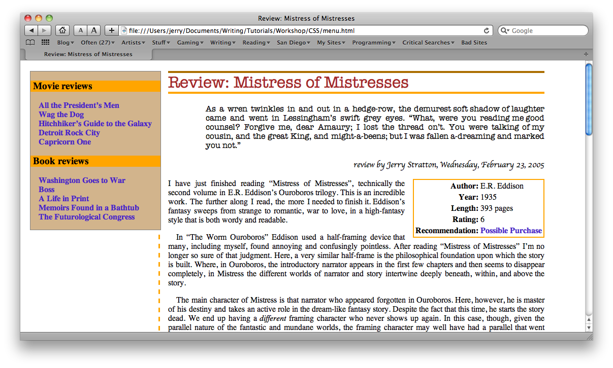
The left side of the menu now jumps over to the dashed border, while the top drops down to exactly the top of the main headline.
This is not exactly what we want; but to get what we want we’re going to have to modify the way the margin is created: we want the menu to be a specific number of characters wide. But the gutter is currently set by percentages: 10% on the left.
Remove the width from the body tag, change margin-left to 17 em, and make the menu’s left side by negative 16 em:
body {
width: 80%;
margin-left: 17em;
margin-right: 5em;
text-align: justify;
border-left-style: dashed;
border-left-color: orange;
border-left-width: .2em;
padding-left: 1em;
position: relative;
}
ul#menu {
background-color: tan;
border: solid .1em grey;
padding-left: 0;
width: 16em;
position: absolute;
top: 0;
left: -16em;
margin-top: 0;
padding-bottom: 1em;
}
In real life, there would probably be a lot more in the left gutter, such as more reviews, information about the reviewers, and perhaps some advertisements or contact information.